Showing posts with label Fiction. Show all posts

2.09.2010

Um, what??

This has to be the funniest title I've seen in a long time. I imagine that to male readers, it's also quite frightening. You're curious what it's about, aren't you? Admit it. You are. Ok, here's part of a review on Amazon.com:

Imagine a world without men where the only way a woman can reproduce is with the help of a giant computerized incubator and a genetically engineered sex toy. Now imagine that this sex toy is intelligent. It has emotions and a soul. It hopes and dreams and it falls in love. This is the premise of Carlton Mellick III's RAZOR WIRE PUBIC HAIR. One of the main characters "The Sister" is a nymphomaniac who is covered from head to toe in vaginas. Celsia is an Amazon warrior with pubic hair made of razor wire. The main character is a genetically engineered hermaphrodite sex toy named Celsia 2 who longs to be loved by his/her owner. Oh, but wait, there's more ... there's sex starved zombies, hordes of marauding rapists, twat frogs, a hoota beasts that is basically just a big hairy vagina with legs, and still another giant talking and apparently quite wise vagina built into the wall of the mansion in which many of these creatures reside. What's most bizarre is that none of this seems to be there for pure shock value. In fact, this perverse menagerie of beings are presented in such a matter of fact manner that it is as if the last thing the author wants is for you to be shocked by them. He wants you to just accept them so that he can just get on with his story. And what a story it is! RAZOR WIRE PUBIC HAIR is the touching tale of a living, breathing, thinking, sex toy that is hopelessly in love with its owner who views it as little more than an object. This book could be a metaphor for so many sexual relationships where one partner is dominant and the other is submissive, struggling to be seen as more than merely an object of lust but as a potential true love.

If anyone reads this book, you are obligated to provide a full book report here!

1.07.2010

I (BikerPuppy) am a single woman hoping to eventually find the man of my dreams. That's why I make fun of the romance novels -- because I'm jealous that they portray as obtainable what I've been so far unable to obtain. This is not for lack of trying, but where does a professional woman meet a suitable man in this day and age? Bars? No, I'm not 22. Book stores? Hasn't worked so far. Dog parks? You'd think this would work, but the men I meet there are married or gay, without exception. That leaves internet dating, which I'm in the process of trying, with mixed results.

However, the cover of Hamilton's book illustrates the danger we face as single women (I guess men face the same danger) looking for love online. It's easy and safe to talk and flirt online and on the phone, but eventually you're going to meet in person. You never know what you're going to get. Fortunately for me, I've never had anyone show up with a razor blade (or at least not one that they've shown to me), but I've had guys show up who are clearly 15 years older than their pictures, who are now covered in tattoos (when their pics showed unmarked skin), or who think it's ok to show up for a first date in ripped or dirty clothing. I guess, given the razor blade alternative, I should be content.


Thanks, Flirt cover artist -- you've scared me into closing my Match.com account and trying Plan B.

12.21.2009

Ick

I know we're in a period of popular culture where vampires are all the rage, so it's no surprise that there are a lot of vampire stories out there. And I know that people have their fetishes, so stories (or book covers) depicting a little light S&M don't really shock me either. But this one just grosses me out. If I were her, the second I felt that icky drip hit my lips, I'd scream the secret safe word ("Dolphin!!") and demand to be untied. Then I'd run far, far away.

Does anyone find this cover (as a whole) appealing? I know our male readers will enjoy the main image, but really, when you add in the bloody cherry.... Or maybe that's the subtext?!?! She just lost her virginity! Still. Ewwwww.

5.24.2009

Sultry Sunday #28 - The weekly "Pop Sensation" crossover

Hey all. I'm back from a month+-long disappearance. Invent your own fantastic reasons for why I was away. While you're doing that, enjoy this:

----

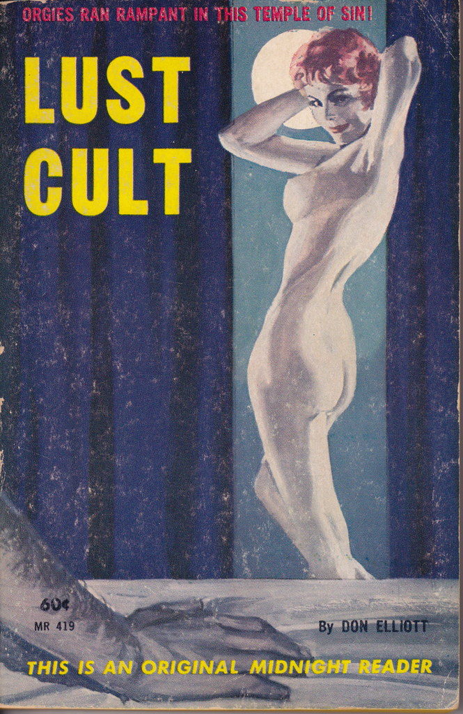
Paperback 230: Midnight Reader MR 419 (PBO, 1962)

Title: Lust Cult
Author: Don Elliott (pseud. of Robert Silverberg)
Cover artist: uncredited


Best things about this cover:

  • What the hell happened to her torso. It's like taffy ... or krazy bread. Yikes. Everything from the bottom of her breast to the middle of her ass needs to be ReDone!
  • When Thing isn't hanging out with the Addams Family ...
  • This is actually a nicely designed cover, as sleaze covers go. Like the rectangular segments - very mid-century modern.

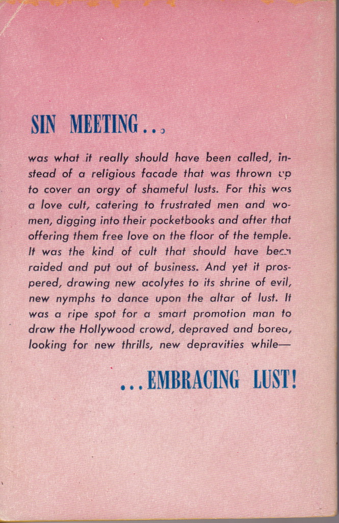
Best things about this back cover:
  • I can tell you that, compared to the back covers of many sleaze novels, this one is remarkably lucid. That is, it doesn't sound it was translated from English into Urdu by a Swede and then back into English by a half-witted Czech.
  • "I'm gonna be late again tonight, honey ... yeah, I've got that damned Sin Meeting I was telling you about ... yeah. Boss really wants us new acolytes to work hard pushing his new 'Shrine of Evil' theme parks ... OK, I'll call you when we're done Embracing Lust!"

Page 123~ (this better be good)

His hands went to her blouse, cupping the ripe thrusts of her breasts.

Oh yeah. That's the stuff. OK, I cheated - that's page 124. But page 123 was all descriptions of driving. Just ... driving. No fun.

I have to believe that if I google "ripe thrusts" right now I get exactly zero hits. . . 71 hits! That's insane. They appear to be all porn sites, although hit 1 appears to be about some kind of lemon. I'm not clicking through to find out.

~RP

5.13.2009

AAAAAAAAAAAAAAAAH!

*maughta runs screaming out of the room.


This is even more scary in person.

4.15.2009

It's all fun and games until someone loses an eye!

Nothing can come close to competing with Maughta's last cover. That was stunningly bad, and a clear winner in any phallicky cover contest.
My last couple offerings haven't been too well received, but hopefully this one will be more agreeable (in a disagreeable way).
Here we have what looks like a middle aged or older guy throwing an anthropomorphic figure into the air. Why? Does he think the kid likes it? Maybe he mistakes her screaming for laughing? Of course, it could be a doll, rather than a kid. And maybe my assumption that he threw it is wrong, and it actually just fell out of the sky. Hmmm, maybe falling out of the sky wouldn't be any weirder than throwing it that high up in the air in the first place. Especially if it's a child.
Of course, it's possible I have it backward and it's actually a kid floating away, tied to balloons that are already out of the frame. THe guy is watching her disappear into the cloudless sky, to land who-knows-where and suffer who-knows-what fate.
Or, I suppose it could even be an alien predator coming down from a spaceship to attack this poor defenseless man who was minding his own business and just walking on his lawn, looking for dandelions and eyeing the punk kids across the street who like to pee on the side of his house when he isn't looking. Now he's going to be devoured by a monster from outer space. Very sad.

4.09.2009

Maybe this kid is really ugly. Maybe he was born without a nose or mouth. Maybe his skin is inside out on all parts of his body other than his arms and upper face. Maybe he fell down just as this picture was being taken. Maybe the photographer fell just as this picture was being taken. Maybe... ok, I've run out of possible reasons for showing nothing but the kid's upper head and arms.

Maybe Daniel isn't talking because you didn't think his mouth was important to the cover of the book.

3.30.2009

Popular outcast?

Before I start snarking on the title and cover, I have to admit I'm a huge Star Wars fan. (Yes, I'm a geek. I also do logic puzzles for fun. But on the flip-side, I also ride my Harley with my dog on the weekends. Does that redeem me? No? Hmm.) I love all of the six SW movies (I've seen A New Hope at least 100 times), and I've read a good number of the "expanded universe" books (books that go beyond the stories and characters of the movies). That's why I find this cover so very disappointing.

First, let's discuss the title. "Fate of the Jedi" is a good new series/trilogy/whatever title. I'm fine with that. But "Outcast"?? Focusing on the Hero of the Rebellion? The guy who single-handedly (well, maybe with a little help from his buddy Han) saved the universe from the evil grip of Darth Vader and the Emperor?? What?? Ok, I admit, Luke was getting pretty weird by the end of Return of the Jedi, and even weirder in some of the books that tell a "later" story, but an "outcast"? I think Mr. Allston was just being lazy in picking a title.

Low, let's get to the cover's aesthetic appeal. Or, rather, complete lack of any aesthetics. Why is it just orange and blue?? The SW universe is an amazingly vibrant and dynamic setting for any story, but all we get is dichromatic blah. There's what appears to be a unique-looking city-scape behind Luke, that might be very visually stunning if it were in color(s). Not to mention either a new Death Star or a cool-looking moon in the sky -- why don't we get to see it clearly? And what's with making Skywalker all blue? They could bother with an extra color for his lightsaber but not for his clothing? What's that boring white strip along the bottom? It appears to be either another city-scape or Luke's EKG reading, but you can barely tell it's there, because... well, it's all white. And why does Luke appear to be disappearing into it? Does the cover bore even him?

I suppose it's probably hard to find artists willing to draw Star Wars art or characters at all, let alone in full color. Seriously, if you search the Internet, you'll hardly find any at all. I guess the publishers did the best they could. Blah!

3.02.2009

Yoooo hooo!

Instead of "The Amateur Marriage" this book should be entitled "The Amateur Homeowners." Or "The Amateur Exhibitionists." I had a neighbor like this once. Very disturbing. I'm pretty sure he had no shades or drapes on the window at all, because they were always open. Maybe he truly was an exhibitionist, but he frequently paraded around naked with a light on at night. Perhaps "paraded" is the wrong word, but he definitely walked around. Unfortunately, it wasn't Brad Pitt or Russell Crowe, you know, a guy you might enjoy seeing walk around in his bedroom. No, he looked a lot like Michael Moore. Very, very scary. I think he accounts for some of my neuroses.

Watch out!

There's nothing overtly wrong with this cover, right? A nice, fancy schmancy pen lying on a sheet of crinkled paper. Very nonthreatening. Why, then, do I feel an almost irresistible urge to step back from the picture? I felt it immediately upon seeing the cover, but it took me a moment to figure out why. I think I'm afraid of being written on. Maybe it's just me, but the pen looks very 3-D (kudos to the photographer or cover artist). I've had many similar-looking pens bleed all over me. I'm uncomfortable just looking at it. Maybe I'm neurotic. Maybe I've stepped over the line into crazy. Maybe.... I think I'll end here.

2.17.2009

Ouch!

This cover makes me very uncomfortable. Why, you ask? Is it because the handsome vampire (apparently the hero of the series) is about to bite this woman on the neck? No. That's standard vampire fare. Is it because the only touch of color is the blood-red (well, more like coral-orange) on her lips? No, though I can't figure out why her lips are red rather than his. Is it because she apparently thought tattooing a bat on her boob was a good idea? Absolutely ouch, but no, that's not it either.

This cover makes me flash back to those hot summer days when, as kids, we would all play with water balloons. Remember that? Epic battles in the streets of your neighborhood? (When I did it, it was before the Super Soaker could take out a whole team in one fell swoop, and before hitting someone with a balloon was a lawsuit-in-the-making.) Remember how, occasionally, you were preparing to whip a balloon at your friend, but you'd grab it too tight? It would strain, strain, strain, and then burst all over you. That's what this cover reminds me of. Maybe her dress is too tight, but I think it's more likely that she has too much silicone in those implants. They look dangerously overinflated!! Any second now, our hero will be saturated, not with blood, but with saline. Yikes!

2.16.2009

Sultry Sunday #22 - The weekly "Pop Sensation" crossover

OK, so it's Sultry Monday. I was away for the weekend, during which I made a new purchase. It ties in nicely with the last post, re: how (not) to use babies on book covers. Enjoy.

-----

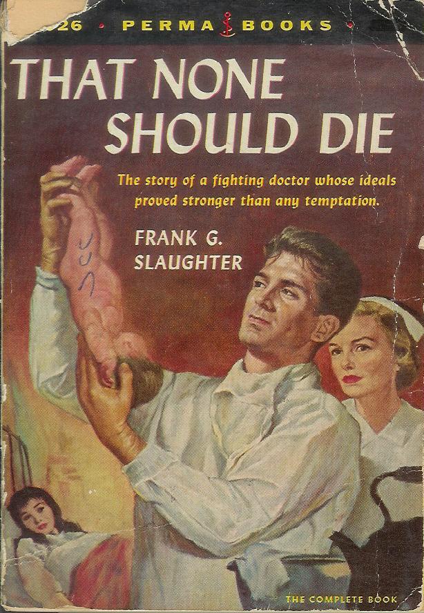
Paperback 200: Perma Books M-4026 (2nd ptg, 1955)

Title: That None Should Die
Author: The insanely prolific Frank G. Slaughter
Cover artist: Charles Binger

So I had an early 70s movie tie-in of Chester Himes' "Cotton Comes to Harlem" all cued up and ready to go as my 200th Paperback ... and then I went to Plattsburgh.


Best things about this cover:

  • This doctor is

a. preparing to shoot the newborn at the ceiling like a rubberband
b. preparing to make "newborn tea"
c. deciding whether to keep it or throw it back
d. looking Way too long and hard at the baby's genital region, or
e. so handsome that nobody cares what he's actually doing

  • I love how the mother is the very least important figure on the cover - almost like an afterthought, or a shorthand visual cue to let you know that the baby is alive and he didn't steal it.
  • "That none should die, Dr. Rand Handsome ingested the mysterious, rune-inscribed baby before it could explode."

Best things about this back cover:

  • "That story alone is fascinating" - uh, no, sorry it's not.
  • If this description makes the book sound anti-socialized/nationalized medicine, that's because the book *is* anti-socialized/nationalized medicine. The first (teaser) page has as its headline: "President announces medical care free to rich and poor alike!" - in this book, that's the terrifying Orwellian future. Because we all know that real doctors are all driven by "ideals" (see cover), unlike nameless bureaucrats who want only to flatten all social distinctions and erect statues of Lenin.

Page 123~

"I shouldn't be saying this, I suppose, but you look like a better class of man than we usually get in a job like this, and I hope you're going to stay with us."


He added, "I mean, I'm not gay or anything, but dear god you're handsome."

~RP

2.08.2009

Sultry Sunday #21 - The weekly "Pop Sensation" crossover

Peer into the shocking world of ... "The Farmers Hotel"

-----
Paperback 197: Bantam 1594 (1st ptg, 1957)
Title: The Farmers Hotel
Author: John O'Hara
Cover artist: Barye Phillips


Best things about this cover:

  • It's @#$#ing John O'Hara and the best blurb provider you can get is Book-Of-The-Month Club News!?!?
  • The design on this cover is Fantastic. It's all a bit too cramped with text for my tastes, but the pictures, small though they are, are vivid and dramatic, and the use of color blocks to build a hotel-like structure - inspired! I especially like how "John O'Hara" functions visually like a chimney and the "S" in "Farmers" is hanging out there like a rain gutter.
  • Hey, is that "Carrie Corrupted" sharing a drink with Joe Bow Tie? At first I thought that she was on her cell phone, but I think it's just a cigarette.
  • Is the lady with the G.I. a. dead, b. really drunk, or c. looking at an airplane flying overhead? Her neck is oddly ... unhinged.
  • You really don't want to check into the Red Room. That is the lesson I gather from this cover.
  • Paperback publishers must have loved O'Hara. He was a writer of "legitimate" fiction who sold off the racks and could be made, with very little fudging, to sound like a writer of soft-core sex fiction. The fifties were all about trying to get glimpses of "brief, shocking intimacy" without being called a perv.

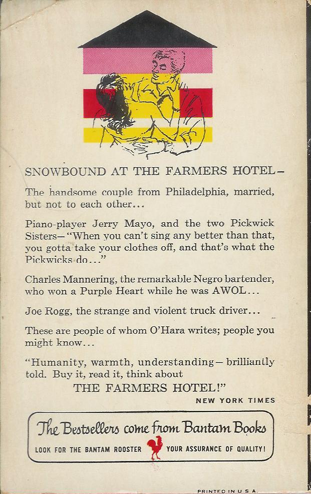
Best things about this back cover:

  • The G.I. and his lady have moved to a small cabin and are now fighting / dancing.
  • Love the campy, dramatic quotation from the Times!
Page 123~

The quiet of the room was almost total, but not peaceful.


~RP

11.30.2008

Sultry Sunday #12 - The weekly "Pop Sensation" crossover

Celebrity edition! Sort of!

----


Paperback 170: Award Books A248X (PBO, 1967)

  • Title: A Korean Tiger
  • Author: Nick Carter (who is also the main character...? and who is also, btw, a Backstreet Boy)
  • Cover artist: Some McGinnis imitator


Best things about this cover:

  • Bring me the floating head of Nick Carter! Oh, nevermind. It's right there.
  • The disembodied head of Nick Carter thinks you're a swell-looking doll. {wink!}
  • If the book is trying to suggest to me that that lady is "Korean," I challenge. She looks like Elvira, Mistress of the Dark, only with somewhat smaller boobs and no shirt.
  • I like how she is taking a sidelong glance at the title, as if thinking "WTF?"
  • How is it possible that no rapper has picked up the name "Killmaster?" That would be my handle for sure. That, or "Optimum Slim" (a name I derived from the cereal I eat every morning)
  • Fake Korean Post-op Elvira Impersonator needs a refill, dammit!

Best things about this back cover.

  • Text! Who doesn't like ... that?
  • Oh my god, I am in love with this book - any book that features the word "slatternly" is hottt with three t's.
  • I hope the "dark underbelly of Asia" is just some really hairy Laotian guy.
  • Paragraph indentations are for suckas!

Page 123~

The wide green stare did not waver. Behind those basilisk eyes he thought he could detect a hint of something warmer. Desire? Plain old-fashioned lust? Was this creature really so human?


Oh please dear god don't let him be talking about the "Korean" woman. "Though she was Korean, she seemed oddly human."

~RP

P.S. this book is immaculate. As crisp and new and bright as the day it first hit the shelves. Maybe there's a tiny amount of scuffing, but it's quite negligible. Paperbacks rarely hold up this well.

11.23.2008

Sultry Sunday #11 - The weekly "Pop Sensation" crossover

I believe it's your (well, all of our) lucky day. Today's book (again, chosen randomly off my shelves) offers a veritable sensory explosion - a (literal) orgy. Behold the gloriousness that is ...

------


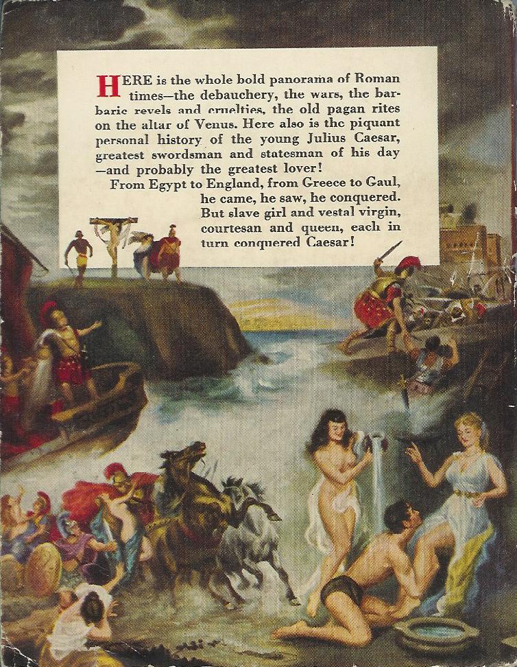
Paperback 167: Universal Giant no. 6 (1st ptg, 1953)


Title: The Private Life of Julius Caesar
Author: William Marston
Cover artist: George Geygan


Best things about this cover:

OK, stop. Hammer time. This book was written by the creator of "Wonder Woman." I Am Not Kidding. And yet none of the booksellers at abebooks mention the connection between this book and "Wonder Woman." You'd think that fact would be one of the main selling points. As I looked at the book, I thought "William Marston" sounded familiar, and then I looked inside and saw the author's middle name (Moulton), which rang even more bells. Then I googled. Holy Krap. From Wikipedia:

Dr. William Moulton Marston (May 9, 1893May 2, 1947) was an American psychologist, feminist theorist, inventor, and comic book author who created the character Wonder Woman. Two women, his wife Elizabeth Holloway Marston and Olive Byrne, (who lived with the couple in a polyamorous relationship), served as exemplars for the character and greatly influenced her creation.[1][2]

He was inducted into the Comic Book Hall of Fame in 2006.

  • "Polyamorous" pretty much describes this cover - I count five different sexual permutations on the front cover alone - and wait til you see the back cover (and the spine!)
  • I love that a "feminist theorist" inspired this (awesome) cover. I guess she who reclines on the bed with the chalice of viscous mauve goo makes the rules. "OK, you kneel! Now you, you kneel more! Kneel wheel!"
  • I love how the whipping scene is strategically placed for her (our) viewing pleasure.

Best things about this spine!!!!:

  • I love how the kinkiest (albeit minutest) scene in the whole tableau is on the spine - no matter how it's shelved, You Will See Flesh.

Best things about this back cover:

  • I know this is an odd thing to say, given the rampant nudity, but those are some well-drawn horses.
  • "Your calves are so smooth..." "Oh, that's just the satyr urine. It works wonders. Here, let us pour some on your back..."
  • Jeez, a crucifixion, too? It's like the painting's running out of ways to exploit the female form.

Page 123~

from a chapter titled, I swear to god, "Ladies' Night"

The pretty young neophyte walked straight to the golden gate, as she had been told to do, and gave her name and that of her sponsor to the door-slave who stood behind the golden bars.

And thus began the first recorded A.A. meeting.

P.S. "door-slave"?

~RP

10.26.2008

Sultry Sunday #7 - The weekly "Pop Sensation" crossover

I passed up a few space-age and western paperbacks to find one perfectly suited for ... Sultry Sunday (the weekly "Pop Sensation" crossover)! Enjoy!
-----

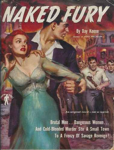
Paperback 155: Phantom Books 509 (PBO, 1952)

Title
: Naked Fury
Author: Day Keene
Cover artist: sadly, uncredited


Best things about this cover:

  • Angry mob!
    • "I'm gonna beat him with this coffee table leg!"
    • "I'm gonna pull my pants up to my rib cage and burn the town down with a troupe of my pasty-faced brethren!"
  • The title is pure pulp - fantastic!
  • One of the greatest pieces of Girl Art I own - her face looks insane, but that dressing gown is gorgeous and the way she's captured in crazy panicked motion is very believable.
  • She is giving us some kind of sign with her right hand: "C" ... Uh, Call the Cops? Crazy people are trying to kill me? C-cup!?
  • I thought the big palooka with the awesome left Fist of Fury was wearing some kind of jacket and open-collared shirt ... but then I noticed the length of that jacket, which appears actually to be some kind of robe. At night, it seems, he likes to dress up like Joan Crawford. Is that why the mob is chasing him? Hate crime!
  • "Revenge" is one of my very favorite words / topics.

Best things about this back cover:

  • Too much Fury, not enough Naked, frankly

Page 123~

Malloy speaking:

"You're not tough. You only think you are. If you guys hadn't been chicken, you'd have let me have it out in Reardon's garage. But killing a two hundred pound man who's willing to fight for his life is a hell of a lot different than shooting a drunken cop from a fire escape or strangling a ten dollar tart."


Mmmm, ten dollar tart ...

~RP

10.05.2008

Sultry Sunday #4 - The weekly "Pop Sensation" crossover

Another Sunday, another installment of "Pop Sensation"

-------

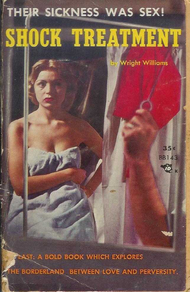
Paperback 147: Beacon Books 143
(PBO, 1957)


Title:
Shock Treatment
Author: Wright Williams
Cover artist: Peeping Tom


Best things about this cover:

  • I love how she looks - not terrified, but exasperated: "You again!?"
  • Wait - I thought she was in her bathroom and the peeping tom was opening the window shade, but it seems just as likely she's in a hospital with mobile curtain dividers, in which case a. whose arm is that?, b. what's it yanking on?, and c. what is that red cloth? What am I looking at!?
  • "AT LAST..." - HA ha. I was just asking myself, "Why is there no book that explores the borderland between love and perversity?" Now, at last, that void is filled.

Best things about this back cover:

  • "Sure, big Eric was crazy. Crazy about women! And who can blame him? Am I right, guys!? Yeah, you know what I'm talking about ... [amused chuckles from drunk comedy club crowd] ... ah, chicks."
  • Whimsical drawings of cruel medical experimentation. "It'll cure your pervertedness, but ... you're gonna experience some rubber-arm, I'm not gonna lie."
  • Maybe those arms are supposed to represent the gyrations of patients at the "hospital dance" (!?)
  • "Not since Snake Pit ..." - I can't stop laughing long enough to comment on that line
  • "Frankly!"
  • "Passion-wracked!"
Page 123~

Instead of thinking of Katrine as a lovely, attractive girl who had bravely come out of a harrowing experience, I was drawing mental pictures of her in bed with a man married to someone else. It was rotten of me, and I almost welcomed the self-loathing that I began to feel.


Well, we've all been there, right?

~RP

9.21.2008

Sultry Sunday #2 - The weekly "Pop Sensation" crossover

Hey, "Judge a Book" readers. Rex Parker here. It's Sunday, so that means it's time for another syndicated episode of my vintage paperback blog, "Pop Sensation"

------

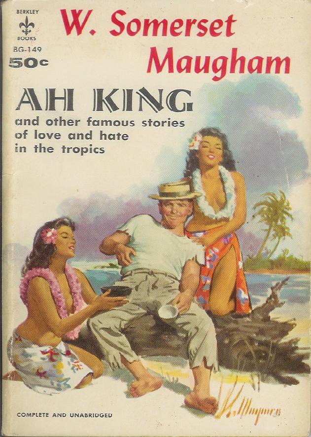
Paperback 141: Berkley Books BG-149
(1st ptg, 1958)


Title: Ah King and other famous stories of love and hate in the tropics (!)
Author: W. Somerset Maugham
Cover artist: Robert Maguire


Best things about this cover:

  • Sometimes, when I've been at the computer for too long, I sit like this. The topless native girls never seem to show up.
  • Could this dude be more oafish? He's literally belly-scratching.
  • I wish we had a better close-up on the women, as Bob Maguire does women, especially faces, better than anyone. The kneeling woman is especially sexy and not just because she's, you know, kneeling. God I wanna photoshop this guy out of the picture so bad.
  • You'd never know from this cover that Maugham is one of the most popular and esteemed writers in British history.

Best things about this back cover:

  • OK, for once, these blurbs all sound awesome. I may actually read stories from this book today. That's a first.
  • Is it just me, or does the type-setting look ever-so-slightly off? Like the black and blue inks were set separately, and aren't quite square to one another. It's making me a bit queasy.
  • If I read just one story in this collection, it will be "The Book-Bag"

Page 123~

"When you left them, after a couple of days at the bungalow, you felt that you'd absorbed some of their peace and their sober gaiety. It was as though your soul had been sluiced with cool clear water. You felt strangely purified."


-from, that's right, you guessed it, "The Book-Bag"; I'm dying to see how a book-bag figures into a story about incest on a rubber plantation. I'll let you know.

~RP

7.31.2008

Judge a Book: You be the Judge!

So occasionally I get masochist authors who want me to snark on their books. Now, we all know I'm too nice to make fun of my readers, right? That's why I leave it to you! Here are a couple of submissions (thanks, Julia and Lee!). Snark away!


Okay, I can't resist snarking on this one. Looks like Blossom got a double mastectomy and is four months pregnant. But my favorite part is the shadowed lettering. Doesn't look like bad photoshop at all!

5.24.2008

Training Manual?

I don't know about you, but I'm pretty sure that this is not the way it's done. Even on the internets (rule 34 notwithstanding).