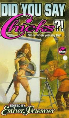
Thanks to faithful reader Snow for suggesting these covers. They're chicks! They're in chainmail! And there must be a big fetish market for this, 'cause they made five compilations.
This is Baen at its classicist (notice I didn't say classiest? I can't even imagine Baen with a bit of class, myself). Yes, she's wearing waaaaay too little, but she's supposed to inspire wet dreams in fourteen-year-olds. At least she's got gauntlets and...ummm...leglets and a shield. Still she obviously kicks ass. Notice the dead guy.
I'm a fan of the title portrayal, too. Hot pink for the Chicks and metallic blue, solid looking CHAINMAIL just works for me.
A- on this cover. A fine effort.
Okay, so no one's dead this time, and the chick is wearing decidedly less armor, but that is the horniest looking elf I've ever seen. And the interrobang rocks (sounds dirty, too).
(DocTurtle says that books like this; a collection of short stories featuring Xena, Warrior Princessesque characters, should be illustrated. "What's the point," he asks, "of the book otherwise?" They have that, dear. It's called Penthouse.)
A fine contribution. A few points taken off for the lack of gore and the ugliness of the chick. I want my chicks in chainail to be smooooooookin'. A solid B+ for this one.
Does anyone have to ask the grade? Absolute A+. TWO hot chicks, an awesome title, and a totally dippy grad-student-looking guy in chains. Can you ask for anything more? Great job, Baen! (Never thought I'd say that!)
That title buries the needle in the awsometer. Her chainmail is getting a little over the top, what with the boots and the belt, but DocTurtle just asked me why I don't look like that ('cause I don't have the boots, of course), so she must be doing something for someone. (DocTurtle is, of course, the most sensitive feminist-type guy I know, so the covers must really be working.)
A good job. A. Missing the plus only 'cause there're not two chicks.
Uck. Did their good artist die? What is this shite? From the top: The font totally sucks. No more do we have the cool metallic font, now it's just boring standard-fantasy-font. Going lower, that chick looks like a man. An ugly man. She's no longer laughing and carefree, now she looks like she's going to go Lorena Bobbit on your ass. And she has the nice phallic sword to do it, too. Linebacker shoulderpads? Blech. Gratuitous panty shot is just, well, gratuitous.
This is just bad. Baen appears to be getting its artists from that matchbook "draw me" ad.
F.
And that's why Baen has sunk and should be mocked by all. Mock away.


14 comments:
I can't believe anyone could say they bought these for the stories and not the covers.
That mailbox really must've pissed that chick off. Or she sent those naughty pictures of herself with no chain mail to the wrong person. Damn...
Maughta, since you asked ... Larry Elmore (the artist for the first three covers) suffered a stroke in the late 90s-early 2000s and has cut back his freelance artwork gig ... so that's probably why they switched artists.
He was the principle cover artist for TSR and DragonLance in the 80s and early 90s.
That should say "first FOUR covers"
The armour that covers the lower part of the leg is called a greave. The kneepad part is a poleyn and the upper leg armour is a cuisse.
The stories are actually quite amusing. The authors know they are playing with (and mostly mocking) a stereotype and have fun with it. I've only read the first 2 and I didn't know 4 and 5 existed, thanks.
Esther Freisner, who edits the series, is a delightful woman with an amazing sense of humor. She's written quite a large number of humorous fantasy novels in her own right.
If I can dig out her email address from my old files I'll try and pass this along to her - I think she'd like to see it.
Obsessive and unnecessary attention to detail is called pedantry.
Posting demeaning comments on a blog or discussion board is called flaming.
Just for fun, try to contort yourself into some of the poses in front of a mirror. Now we see why these ladies have such toned bods - holding poses for artists.
I second Larry's comment. Ms. Friesner is awesome! She prognosticates using hamster wheels.
I love the Chicks'n Chained Males cover. All it needs is a kiddie pool filled with jello.
mooselet, she just forgot to put a stamp on the envelope.
Waiting for it to come back due to insufficient postage, or committing a federal crime by vandalising a mailbox. What's a chainmail chick to do?
I applaud the first, official, Bellybutton Baen Day. Yay!
I'm upset about rising postage prices, too, but damn!
Just try Couponalbum.com and save lots of money while shopping online from many brand name stores....!!
These have to be the most lesbian books I've ever seen. Love, Sexy Sadie
I prefer the political thriller counterpart to this series:
"Chickanery". Much better that the male version, "Dudeplicity".
Tremble! For I too can produce pejorative-gender-label puns! Your move, Esther Friesner.
I also quite like this series. I think the first four covers do exactly what they are aiming for, though the butt on the last one is a bit much.
Post a Comment