 There's nothing overtly wrong with this cover, right? A nice, fancy schmancy pen lying on a sheet of crinkled paper. Very nonthreatening. Why, then, do I feel an almost irresistible urge to step back from the picture? I felt it immediately upon seeing the cover, but it took me a moment to figure out why. I think I'm afraid of being written on. Maybe it's just me, but the pen looks very 3-D (kudos to the photographer or cover artist). I've had many similar-looking pens bleed all over me. I'm uncomfortable just looking at it. Maybe I'm neurotic. Maybe I've stepped over the line into crazy. Maybe.... I think I'll end here.
3.02.2009
Watch out!
There's nothing overtly wrong with this cover, right? A nice, fancy schmancy pen lying on a sheet of crinkled paper. Very nonthreatening. Why, then, do I feel an almost irresistible urge to step back from the picture? I felt it immediately upon seeing the cover, but it took me a moment to figure out why. I think I'm afraid of being written on. Maybe it's just me, but the pen looks very 3-D (kudos to the photographer or cover artist). I've had many similar-looking pens bleed all over me. I'm uncomfortable just looking at it. Maybe I'm neurotic. Maybe I've stepped over the line into crazy. Maybe.... I think I'll end here.

2.27.2009
Pointedy Phallic
How's it hangin'? Apparently to the left.


This is like the anti-phallus book. It's all sharp and pointy and you want to yell out, "No! Don't touch it!" There's nothin' right about that. I wish the side and back of the book continued with the chick picture so we could see her face making that sexy-pouty-lip-lickin' kinda face. 'Cause you know that's what she's doin'. Or have I been watching too many beer commercials?
(I want to take this moment to prostrate (prostate) myself at the feet of BikerPuppy, who's been doing such and excellent job keeping up slack. Don't worry, Maughtamom, I'll start doing my own blog again, but it's always nice to have help.)
Yummy!
 In keeping with the childishness I demonstrated with my last post, I thought this would be a great book for Friday. Nothing phallicky today (sorry!), but at least a good send-off for the weekend. I wasn't going to post it, but the comments on the Moose with Loose Poops post made me think I'm not the only one who appreciates juvenile (and somewhat scatological) humor. Teehee!
 As with the last book, it's the title that gets me. Did they really not think of it when they titled this book? Or are they just as bad as I am, laughing to themselves ("poop!!") as they send the book out for distribution? I would suspect it's the latter, but given some of the awful book covers we've seen, it might be that some publishers are just more clueless than I give them credit for.
Enjoy! (And think of this next time you make cookies!)
2.25.2009
Um.... what?
 Sorry for posting twice in one day, but this made me laugh so hard I couldn't wait to put it up. Actually, I almost peed my pants. I know I'm not really laughing at the cover. My juvenile sense of humor can't get past the title. I'm sure this is a wonderful book to teach kids about being sick, but... the word "poop" is in the title! I just can't stop giggling. Make it stop!! Poop!!!
Familiar?
 Is there anyone who looks at the cover of The Singing and doesn't think of the painting "American Gothic" (http://en.wikipedia.org/wiki/File:Americangothic.jpg)?
From what I can glean from the reviews on Amazon, this book (and the series) borrows heavily from The Lord of the Rings. Having not read Croggon's book, here's what I believe, based solely on the cover: Where Tolkien's world is both bright and vibrant and dark and ominous, Croggon's world is drab and dull and ugly. A weak sun and a bleak landscape surround characters who hold little interest for the viewers. The boy either has a haughty expression, looking down his nose at the reader, or is about to sneeze. The girl is holding a lap harp, but does the picture engender any interest about her playing abilities? No. Do you wonder where they are going? Or why they stopped here? No. Surround that drabness with orange and you have the epitome of boring.
At least with American Gothic, you wonder what the lady is looking at, why her husband is holding the pitchfork tine-side up, and where they got their ugly curtains.
2.18.2009
Stay silent!
 This has to be one of the dreariest covers I've ever seen. I guess that's supposed to be a waterfall behind her, which is nice (although not "silent"), but we are looking at her through a dirty, mossy pane of glass. Grubby.
 I have nothing against poetry, although I'm more a fan of poets like Shakespeare and Frost than the stuff in this book (Amazon will let you read a few pages). I don't even mind "dark" poetry - I'm quite fond of Poe, actually.
However, with this cover, this book just screams "dull and depressing" to me. The hat she's wearing is very unattractive, for one thing, and I'm pretty sure her shirt is made out of sack-cloth. More depressing, though, is her strained expression. I can't tell what she's trying to convey. It's not exactly a mysterious expression, just ... weird. Like she's horribly constipated or something. Doesn't make me eager to read this.
2.17.2009
Ouch!
 This cover makes me very uncomfortable. Why, you ask? Is it because the handsome vampire (apparently the hero of the series) is about to bite this woman on the neck? No. That's standard vampire fare. Is it because the only touch of color is the blood-red (well, more like coral-orange) on her lips? No, though I can't figure out why her lips are red rather than his. Is it because she apparently thought tattooing a bat on her boob was a good idea? Absolutely ouch, but no, that's not it either.
This cover makes me flash back to those hot summer days when, as kids, we would all play with water balloons. Remember that? Epic battles in the streets of your neighborhood? (When I did it, it was before the Super Soaker could take out a whole team in one fell swoop, and before hitting someone with a balloon was a lawsuit-in-the-making.) Remember how, occasionally, you were preparing to whip a balloon at your friend, but you'd grab it too tight? It would strain, strain, strain, and then burst all over you. That's what this cover reminds me of. Maybe her dress is too tight, but I think it's more likely that she has too much silicone in those implants. They look dangerously overinflated!! Any second now, our hero will be saturated, not with blood, but with saline. Yikes!
2.16.2009
Sultry Sunday #22 - The weekly "Pop Sensation" crossover
OK, so it's Sultry Monday. I was away for the weekend, during which I made a new purchase. It ties in nicely with the last post, re: how (not) to use babies on book covers. Enjoy.
-----
Paperback 200: Perma Books M-4026 (2nd ptg, 1955)
Title: That None Should Die
Author: The insanely prolific Frank G. Slaughter
Cover artist: Charles Binger
So I had an early 70s movie tie-in of Chester Himes' "Cotton Comes to Harlem" all cued up and ready to go as my 200th Paperback ... and then I went to Plattsburgh.

Best things about this cover:
a. preparing to shoot the newborn at the ceiling like a rubberband
b. preparing to make "newborn tea"
c. deciding whether to keep it or throw it back
d. looking Way too long and hard at the baby's genital region, or
e. so handsome that nobody cares what he's actually doing

Best things about this back cover:
Page 123~
He added, "I mean, I'm not gay or anything, but dear god you're handsome."
~RP
-----
Paperback 200: Perma Books M-4026 (2nd ptg, 1955)
Title: That None Should Die
Author: The insanely prolific Frank G. Slaughter
Cover artist: Charles Binger
So I had an early 70s movie tie-in of Chester Himes' "Cotton Comes to Harlem" all cued up and ready to go as my 200th Paperback ... and then I went to Plattsburgh.
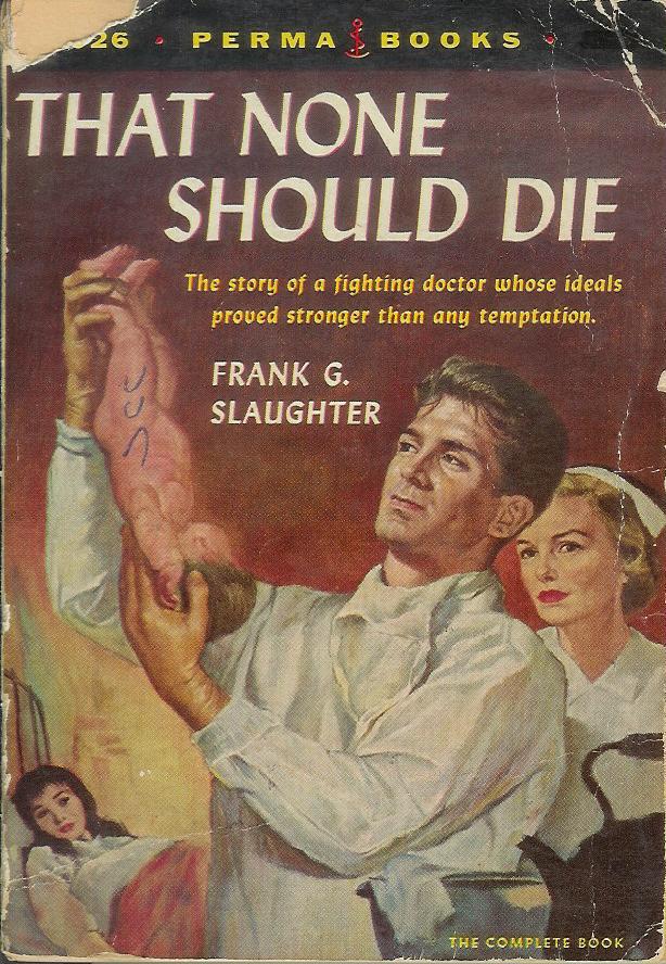
Best things about this cover:
- This doctor is
a. preparing to shoot the newborn at the ceiling like a rubberband
b. preparing to make "newborn tea"
c. deciding whether to keep it or throw it back
d. looking Way too long and hard at the baby's genital region, or
e. so handsome that nobody cares what he's actually doing
- I love how the mother is the very least important figure on the cover - almost like an afterthought, or a shorthand visual cue to let you know that the baby is alive and he didn't steal it.
- "That none should die, Dr. Rand Handsome ingested the mysterious, rune-inscribed baby before it could explode."

Best things about this back cover:
- "That story alone is fascinating" - uh, no, sorry it's not.
- If this description makes the book sound anti-socialized/nationalized medicine, that's because the book *is* anti-socialized/nationalized medicine. The first (teaser) page has as its headline: "President announces medical care free to rich and poor alike!" - in this book, that's the terrifying Orwellian future. Because we all know that real doctors are all driven by "ideals" (see cover), unlike nameless bureaucrats who want only to flatten all social distinctions and erect statues of Lenin.
Page 123~
"I shouldn't be saying this, I suppose, but you look like a better class of man than we usually get in a job like this, and I hope you're going to stay with us."
He added, "I mean, I'm not gay or anything, but dear god you're handsome."
~RP
2.12.2009
Aaauuuggghhhh! Run!!!

OMG!! If THAT is what's coming to me, I'm not waiting until it arrives!! It's a giant, levitating, half-headed baby! Run for your lives!!
I honestly can't tell what they were thinking. The book is a comedic novel, according to amazon, and takes place at a Southern university. Ok, that explains the buildings. But what's so funny about a ginormous, angry-looking baby without clothes?
Being an avowed non-mom, I would never, ever pick up this book. I'm curious about the rest of you, especially the moms. Does this attract or repel you?
2.10.2009

Nothing says "poetry" better than a ton of white space and stark black lettering. Or maybe it's my non-artistic self just getting in the way again. Maybe I'm supposed to see the sorrow of the world represented by the separation between our hero ("Poetics") and the object of his affection (the rose). Or maybe it's supposed to remind me of some specific poetry: "A rose by any other name...." No. Wait. That's Shakespeare, not Aristotle. Hmmm, what could I be missing? Or could it just be that this is a dumb cover? Could it really be that simple?
2.08.2009
Sultry Sunday #21 - The weekly "Pop Sensation" crossover
Peer into the shocking world of ... "The Farmers Hotel"
-----
Paperback 197: Bantam 1594 (1st ptg, 1957)
Title: The Farmers Hotel
Author: John O'Hara
Cover artist: Barye Phillips

Best things about this cover:

Best things about this back cover:
~RP
-----
Paperback 197: Bantam 1594 (1st ptg, 1957)
Title: The Farmers Hotel
Author: John O'Hara
Cover artist: Barye Phillips

Best things about this cover:
- It's @#$#ing John O'Hara and the best blurb provider you can get is Book-Of-The-Month Club News!?!?
- The design on this cover is Fantastic. It's all a bit too cramped with text for my tastes, but the pictures, small though they are, are vivid and dramatic, and the use of color blocks to build a hotel-like structure - inspired! I especially like how "John O'Hara" functions visually like a chimney and the "S" in "Farmers" is hanging out there like a rain gutter.
- Hey, is that "Carrie Corrupted" sharing a drink with Joe Bow Tie? At first I thought that she was on her cell phone, but I think it's just a cigarette.
- Is the lady with the G.I. a. dead, b. really drunk, or c. looking at an airplane flying overhead? Her neck is oddly ... unhinged.
- You really don't want to check into the Red Room. That is the lesson I gather from this cover.
- Paperback publishers must have loved O'Hara. He was a writer of "legitimate" fiction who sold off the racks and could be made, with very little fudging, to sound like a writer of soft-core sex fiction. The fifties were all about trying to get glimpses of "brief, shocking intimacy" without being called a perv.
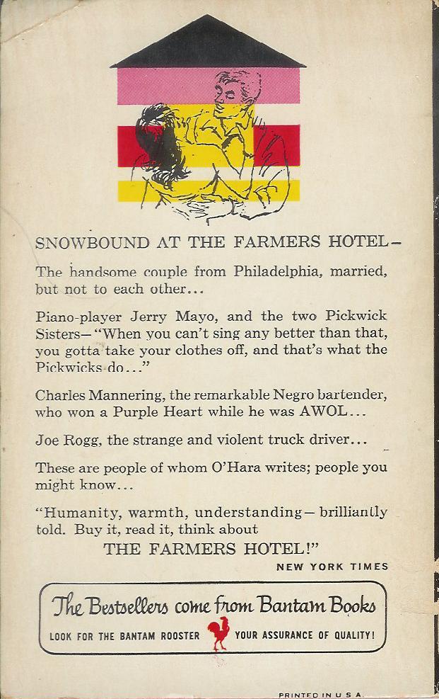
Best things about this back cover:
- The G.I. and his lady have moved to a small cabin and are now fighting / dancing.
- Love the campy, dramatic quotation from the Times!
The quiet of the room was almost total, but not peaceful.
~RP
2.06.2009
It's Phriday!

This cover is from the American printing of one of my very favorite books (the first in a trilogy). Sorry, it's a bit dark, but you can see a bigger brighter image on Amazon at (http://www.amazon.com/gp/reader/055327211X/ref=sib_dp_pop_fc?ie=UTF8&p=S001#reader-link).
Generally, I think this is a well-done cover depicting a scene from the first chapter of the book. What's the problem, then, you ask? First I'll give you the less obvious, and then move on to the reason this is perfect for Phriday. The woman kneeling is the main character, ready to reject the world and devote herself to temple life. Yet, for some reason, even as she prepares to take her vows and turn her back on the pleasures of the flesh, she feels the need to coat her face in cosmetics? And do her hair up all gorgeous? And apply a fresh coat of nail polish? Um... no. Second, the soldier behind her is the Commander of her father's army. He's in his late 50s or early 60s in the book -- not his 20s. Would it really be so hard to make him older? Readers aren't THAT shallow, are they? Are they? Also, he has just come from a furious battle in which his army was decimated and he, himself, was injured, yet is depicted wearing ceremonial armor without a speck of blood to be seen. Huh??
Ok, now to the obvious. You all know where I'm going, don't you? What is going on with the front of his armor? I'm sure this guy is a strapping young soldier, but not even HE could need protection that far down, could he? And why is it shaped like that? It's like a neon sign, pointing to ... well, actually to the ground, but it is obviously a subliminal message meant to make women swoon. And we might, if only we weren't so distracted with the purple feathers on his head.
2.05.2009
Pinhead in Orange

Let me start by admitting I'm no fan of "modern" or abstract art. The hallways outside my office are filled with Jackson Pollock and Paul Klee, and other kindergartners' drawings. When walking past them, my reaction ranges from rolling my eyes to getting furious that our company's dollars are being spent on a picture of a line. My rule is: If I can do it, it isn't art.
The cover of Buddhism for Mothers just irritates me. I would never read this book, just because of the cover. Seriously, why would the "artist" shrink the woman's head down to the size of a pool cue? What is that supposed to signify? To me, it implies that once you DO read it, your head will implode and will have no brain left for rational thought. Also, you will be sucked into a world resembling the inside of an orange Jolly Rancher. With creepy little trees growing in the distance. Or are they even trees? They are shaped more like rat poops.
The text at the top bugs me too: "This is an excellent, practical guide to Buddhism not just for mothers, but for everyone who has ever had a mother." What?? Are they trying to say it's for everyone? Why not just say that? It's hurtful to those who never had a mother. They are specifically excluded, and that's just mean.
2.01.2009
Sultry Sunday #20 - The weekly "Pop Sensation" crossover
Rex Parker here with the latest Sultry Sunday vintage paperback write-up - have at it!
----
Paperback 194: Gold Medal 122 (PBO, 1950)
[For Kathy P]
Title: One Wild Oat
Author: MacKinlay Kantor
Cover artist: Willard Downes

Best things about this cover:

Best things about this back cover:
Page 123~
I'm sorry, but "nostrils" pretty much sucked the sexy vibe right out of the room.
~RP
----
Paperback 194: Gold Medal 122 (PBO, 1950)
[For Kathy P]
Title: One Wild Oat
Author: MacKinlay Kantor
Cover artist: Willard Downes
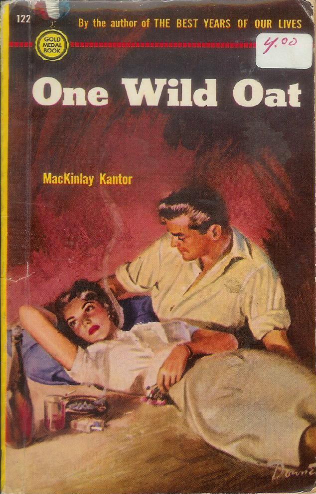
Best things about this cover:
- "I regret that I have but one wild oat to sow for my country."
- I looked up ENNUI in the dictionary and found this picture.
- "Whatsa matter, baby? Don't you like it here in my cave?"
- Neither liquor, nor cigarettes, nor, uh, whatever Native American bauble she's playing with there, could move Louise to give Rock Handsome the time of day.
- This painting went up for auction on-line a couple of years ago
- Don't you love it it when booksellers put price stickers directly onto the covers of vintage paperbacks covered in delicate, easily destroyed Perma-Gloss? I know I do. (Sticker is probably removable - I just never tried, as the Perma-Gloss on the cover is virtually undamaged)
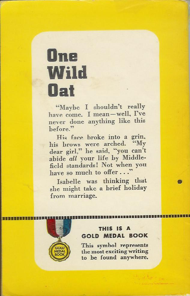
Best things about this back cover:
- "My dear girl" ... "abide" ... was she abducted by a randy English butler?
- I'm guessing that "Middlefield" represents the Middle-class standards of Middle America
- Love how the last paragraph reads almost like a non sequitur. So casual. Like she was contemplating hanging new curtains.
Page 123~
The scent of mulled wine was in her nostrils, the ringing of Prokofiev in her ears, as - shaking, still reluctant - she awarded herself to LeRoy for that sacred moment, and touched her face against his.
I'm sorry, but "nostrils" pretty much sucked the sexy vibe right out of the room.
~RP
1.29.2009
Guest Blogger BikerPuppy!

Let me start by saying I love sci-fi/fantasy novels. I've read them since I was a kid, and I got used to seeing women in impossibly uncomfortable"armor" that covered nothing more than nipples and nether regions and warriors with glistening muscles that would make Schwarzenegger jealous. There's no disputing the bad covers, though, and Judge a Book has done an amazing job bringing us the best of the best. So in that vein, let's take a look at The Bastard Prince's cover. I'm guessing the guy on the right is the bastard, because he is the only one wearing a crown. I'm not sure if he's a bastard because his parents weren't married or because he is trying to incinerate the woman next to him with the Force. Or maybe he's trying to protect her, and, amazingly, he's doing all this while levitating from his saddle, riding a horse that is almost on fire. But enough about our prince. Let's turn to the heroine. I guess she's riding side-saddle, which might explain why she appears to be levitating in front of her horse, but on close inspection, I think she's giving birth to a flaming ghost baby, while her horse looks for some non-flaming grass to eat. It's nice to know that all this is happening under a lovely blue sky, despite the storm in the distance.

This cover is waaaay too busy! Between the rolling waves and the sky full of lightening, it's visually appalling. It appears our hero is trying to save his ship by acting as a human lightening rod, holding his sword up during a storm. Or maybe he's just threatening the storm: "Come any closer and I'll cut off your....er.... lightening."
Thanks, BikerPuppy! What do you think, folks, should we keep Ms. Puppy on?
1.28.2009
Wednesday Quickies
Okay, I know I've been letting y'all down recently, and I'm sorry. Mucho gracias to Rex who's been holding up the Judge a Book torch all by himself. A round of applause for Rex, y'all! Whooo hoooo!
Anyway, just a few quickies for Wednesday:
First up is something I saw and immediately dubbed "Condom Head."


Anyway, just a few quickies for Wednesday:
First up is something I saw and immediately dubbed "Condom Head."

Sorry for the size, but a funny thing happened when I went looking for a copy of this picture. It seems other folk have noticed the "condom head" phenomenon; the only pictures I could find without a super ton of digging didn't have the condom tip.
More Amazon censoring, perhaps? In fact, the only pictures I could find with the "tip" were user uploaded covers from Library Thing. Hmmmmmmmm.
UPDATE: The first cover is the real cover. I saw it in person. The tip is there and the title is Last Train to Arcturus. The second is the cover that appears at Amazon and other places on the net (fantasticfiction.co.uk, Bunns and Noodle, etc.) because they steal the image from Amazon. I propose that Amazon or someone equally creepy (Dick Cheney?) altered it to appear more "palatable," i.e. without the condom tip on the head. In the process, they FUCKED UP THE TITLE!!! Thanks, DocTurtle, for pointing this out. In the second cover, Arcturus is spelled Acturus. Ah hah! Conspiracy!All your base are belong to us*.
I would totally read this book if it were called All Your Heart are Belong to Us.
*google it, Mom
1.25.2009
Sultry Sunday #19 - The weekly "Pop Sensation" crossover
Once more, a syndicated installment of "Pop Sensation"
-----
Paperback 191: Popular Library 69 (1st ptg, 1946)
Title: The Listening House
Author: Mabel Seeley
Cover artist: [H. Lawrence Hoffman]

Best things about this cover:

Best things about this back cover:
Page 123~
Now that's a quote that makes me want to keep reading. For once.
~RP
-----
Paperback 191: Popular Library 69 (1st ptg, 1946)
Title: The Listening House
Author: Mabel Seeley
Cover artist: [H. Lawrence Hoffman]

Best things about this cover:
- Yeah, if the house I was walking past suddenly grew a gigantic ear, I'd run like hell too.
- Is the runner holding a boomerang? Is he texting someone? Did the ice cream fall out of his cone? His forward hand looks very wrong.
- While I love the more realistic, lurid, 50s-60s covers the most, I have a strange affection for these more abstract early covers. Hoffman did some great work in the 40s. I'm pretty sure I have more from him coming up in my collection.

Best things about this back cover:
- This description sounds more Gothic than Mystery. A creaky old house ... on a cliff?
- I love the can-do, plucky optimism of the early paperbacks. They all had adorable slogans back then - "Mysteries of Proven Merit" Not sure what's going on with the quotation marks. When you say it about yourself, it's not really a quote.
Page 123~
"Mrs Dacres, did you ever spend any thought at all on why society makes such a hue and cry about murder? After all, by and large, I've found out that most of the people who get murdered leave the world better off for their absence."
Now that's a quote that makes me want to keep reading. For once.
~RP
1.18.2009
Sultry Sunday #18 - The weekly "Pop Sensation" crossover
Someday Maughta will post something new - til then, you get this. Enjoy:
-----
Paperback 189: Signet D1628 (1st ptg, 1959)
Title: The Sound and the Fury
Author: William Faulkner
Cover artist: photo

Best things about this cover:

Best things about this back cover:
Page 123~
I can't believe I just Page 123'd William Faulkner. John Faulkner, sure, but William? The indignity!
~RP
-----
Paperback 189: Signet D1628 (1st ptg, 1959)
Title: The Sound and the Fury
Author: William Faulkner
Cover artist: photo
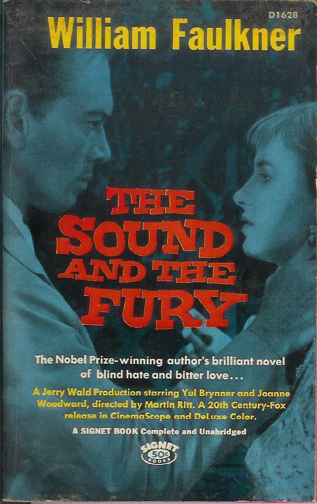
Best things about this cover:
- Best thing? Hmmm. I can't decide. It's either the sound or the fury.
- I see the "Fury" (Yul Brenner tries to strangle Joanne Woodward) - the "Sound"? I guess it's the sound of me gasping at the sight of Yul Brenner with hair.
- This blue tint is so dark that it renders the picture almost irrelevant. I love the hand-drawn fon on the title. Makes the book look like an adaptation of a wacky Disney movie.
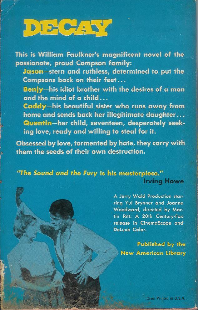
Best things about this back cover:
- "DECAY" - Why would I read any farther after that? That is perhaps the best single-word tagline I've ever seen on a book. And the bright, whimsical font! Inspired.
- By the picture, I would surmise that this is the story of an aging pirate with a bad hairpiece and massive pit stains who wants nothing more than for Maria from "Sound of Music" to admire his chest hair.
Page 123~
"Oh, forget your damned clothes. Does your eye hurt?"
I can't believe I just Page 123'd William Faulkner. John Faulkner, sure, but William? The indignity!
~RP
1.11.2009
Sultry Sunday #17 - The weekly "Pop Sensation" crossover
Once again, a syndicated installment of "Pop Sensation" -
-----
Paperback 186: Gold Medal 947 (PBO, 1960)
Title: Danger Is My Line
Author: Stephen Marlowe
Cover artist: Uncredited (looks like Barye Phillips a little)

Best things about this cover:

Best things about this back cover:
Page 123~
"Deep Thoughts," by Chester Drum
~RP
-----
Paperback 186: Gold Medal 947 (PBO, 1960)
Title: Danger Is My Line
Author: Stephen Marlowe
Cover artist: Uncredited (looks like Barye Phillips a little)

Best things about this cover:
- "Oh, don't mind me, I'm just..."
- "tying my ... pump"
- "doing some very advanced step aerobics"
- "trying to figure out the most auspicious way to present my magnificent rear end to the world"
- Chester Drum looks like he's prepping to give someone a very unpleasant exam
- "Danger Is My Line" is a beyond-lame title - along with the author's last name (Marlowe), it furthers the impression that the book will be a horrid rip-off of Chandler (who wrote "Trouble Is My Business")

Best things about this back cover:
- So Chester Drum is ... a lamb. Either that, or one of Mary's lambs wants to screw her.
Page 123~
Maybe he got the belly from drinking too much beer or maybe he got it from eating criminals alive - but the overall impression he gave, penguin-body, rimless hexagonal glasses, merry twinkling eyes, was about as deadly as a house-cat's. Still, I told myself, these things are relative - house-cats are pretty deadly: to rats.
"Deep Thoughts," by Chester Drum
~RP
1.04.2009
Sultry Sunday #16 - The weekly "Pop Sensation" crossover
With apologies for failing to produce a write-up last week, I offer you this week's "Pop Sensation" crossover:
-------
Paperback 183: Avon T-291 (PBO, 1959)
Title: Death is the Last Lover
Author: Henry Kane
Cover artist: uncredited

Best things about this cover:

Best things about this back cover:
Page 123~
Wow, she talks a lot cooler than she looks.
-------
Paperback 183: Avon T-291 (PBO, 1959)
Title: Death is the Last Lover
Author: Henry Kane
Cover artist: uncredited

Best things about this cover:
- The color scheme. It's gutsy - pink, baby blue, and then ... some kind of maroon
- The title - sensationalist writing at its best / worst. Does she literally sleep with Death, or does her John kill her, or what?
- Thank god Death was her last lover - that makes a much better title than "Herb the Copier Salesman from Wichita is the Last Lover"
- Her face is unfortunate. The painting makes her look vapid, which is inherently unsexy. I do dig that oversized hat box she's sitting on, though. Her legs and cleavage aren't awful either.
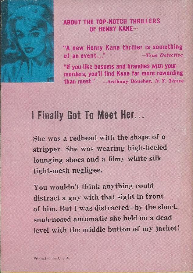
Best things about this back cover:
- Personally, I like "bosoms and brandies" with pretty much anything.
- That negligee has too many adjectives. It stopped being sexy right around adjective #3
- Oh look, it's that insipid face again. Nope, it's no sexier in blue tone.
Page 123~
I sat near her, enjoying the warmth of her thigh. "Honey," I said, "you're a nice, sweet, attractive gal, and I'm crazy about you."
"Yeah, I remember," she said.
Wow, she talks a lot cooler than she looks.
Subscribe to:
Posts (Atom)


