4.24.2009

Phallic Earth Day (a little late)

Thanks to Tom, who sent me this cover, I now see phalluses in innocent little water bottles...turgid little water bottles...with glistening droplets, um, glistening...Oh, just look at this cover!


4.22.2009

Dinner anyone?

I'm not going to snark on this cover because I think it is the funniest title I've ever read!! It's satire (which I love), and I may just have to pick it up!! BTW, I stole the idea from the fail blog (failblog.org), who had it posted this morning.

4.21.2009

Save the anonymous male.


This book discusses how the feminist movement went beyond its original aim (of bringing equality to women) to the point of minimizing the importance of men and masculinity in families,relationships, and society. It actually sounds rather interesting.
What amuses me is that this is yet another cover that anonymizes someone. Ok, I get the argument about the autism book (the boy with no lower face), but if this book is about the importance of men, why cut off his face? Not to mention that the block of white with the title and subtitles is just ugly and unimaginative (in my oh-so-humble opinion). And why is it all spread out that way? They should have made the white square smaller or the subtext bigger. Just annoys me.

4.19.2009

Sultry Sunday #27 - the weekly "Pop Sensation" crossover

Hey all. Rex Parker here, back from a little vacation (Costa Rica), and ready to drop some more fresh vintage covers for you all once again. Let's see ... yes, this will do:

Paperback 221: Permabooks M-4289
(1st ptg, 1963)


Title: Like Love
Author: Ed McBain
Cover artist: Robert McGinnis


Best things about this cover:

  • "Dear God, please let me score with this chick from Cirque de Soleil. Amen."
  • "Dammit! Why won't my eyebrows stay *down*!?"
  • "Man, my thumbnails look *weird* up close..."
  • "Oh, Steve, I'm tired of you and your shadow puppets. Can't we just get back to hanging drapery?"
  • What the hell is with the title?: "It's *like* love, baby, just ... minus all the caring and sharing and listening to your damned problems. OK?"
  • This will sound odd, but the softness of the coloring and the fine pattern on the wallpaper reminds me of John Singer Sargent portrait that I love.

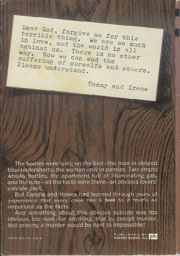
Best things about this back cover:

  • Tommy and Irene - sounds like a one-hit wonder pop duo from 1963
  • Carella and Hawes - sounds like a crime-fighting duo from 1974
  • "ourselfs" - ouch
  • Authentic imitation wood paneling! Really, one of the awesomest design choices in modern back cover art history

Page 123~

"Miscolo!" he yelled.
"Yo!" Miscolo yelled back from the Clerical Office.
"Bring in some iodine and some Band-Aids, will you?"
"Yo!" Miscolo answered.

~RP

4.15.2009

It's all fun and games until someone loses an eye!

Nothing can come close to competing with Maughta's last cover. That was stunningly bad, and a clear winner in any phallicky cover contest.
My last couple offerings haven't been too well received, but hopefully this one will be more agreeable (in a disagreeable way).
Here we have what looks like a middle aged or older guy throwing an anthropomorphic figure into the air. Why? Does he think the kid likes it? Maybe he mistakes her screaming for laughing? Of course, it could be a doll, rather than a kid. And maybe my assumption that he threw it is wrong, and it actually just fell out of the sky. Hmmm, maybe falling out of the sky wouldn't be any weirder than throwing it that high up in the air in the first place. Especially if it's a child.
Of course, it's possible I have it backward and it's actually a kid floating away, tied to balloons that are already out of the frame. THe guy is watching her disappear into the cloudless sky, to land who-knows-where and suffer who-knows-what fate.
Or, I suppose it could even be an alien predator coming down from a spaceship to attack this poor defenseless man who was minding his own business and just walking on his lawn, looking for dandelions and eyeing the punk kids across the street who like to pee on the side of his house when he isn't looking. Now he's going to be devoured by a monster from outer space. Very sad.

4.10.2009

Phriday Hall of Phame (and Shame!)

I...I just don't know what to say about the following cover, sent to me by the kind people at Powell's Books* in Phort...erm, Portland. It is the most phallic cover I've ever seen (and, let me tell ya, I've seen a lot of phallic covers!). Every single element in this cover is phallic. As Dot from Powell's put so aptly, "may I present to you the hairy vulgarity of Neal Barrett Jr's Stress Pattern."


Also from Dot:

I think that the detail that inspires the fiercest unholy shuddering, personally, is those tufts of wiry pubic hair wriggling out from the beast itself. But yes, I could envision this cover as a Highlights magazinesque "How Many Phalluses Can You Spot? Find and Circle Them All!" feature.


Personally, I'm finding the little guys who are shaped like penises to be the most abhorrent, myself. Or maybe the human's hat?


*Powell's is an awesome bookstore that earns the seal of approval of this blog. Yay, independents! Beat off the one-breasted bitch!


4.09.2009

Maybe this kid is really ugly. Maybe he was born without a nose or mouth. Maybe his skin is inside out on all parts of his body other than his arms and upper face. Maybe he fell down just as this picture was being taken. Maybe the photographer fell just as this picture was being taken. Maybe... ok, I've run out of possible reasons for showing nothing but the kid's upper head and arms.

Maybe Daniel isn't talking because you didn't think his mouth was important to the cover of the book.

4.07.2009

What could this be about?


I find this cover uninspired and goofy. Yes, it has the "wonderful" Mona Lisa (whose lack of eyebrows I've always found kinda freaky), a classic of Italian Renaissance art and most famous resident of the Louvre. But that big fat orange question mark strikes me as very silly. Hmmmm, what could this book be about? Without looking at the title, one would guess it is about the identify of the model. One would be wrong.
The title (you really have to squint to see it) is Vanished Smile: The Mysterious Theft of Mona Lisa. It tells the story of when the painting was stolen from the Louvre in the early 1900s, which sounds like an interesting read to me. I just find the cover so boring -- a clash of the sublime and the stupid. Maybe I just hate orange?
Anyway, an interesting factoid is that no one noticed the painting was gone for a full 24 hours. I'm sure some visitors to the Louvre would have assume that it had been removed for cleaning or restoration or something, but you would think someone would have asked. Maybe they didn't have any security guards back then. Or, more likely, the guards were French, and no one is afraid of the French. See the video below for proof. (By the way, I'm 1/4 French, so I have at least some standing to jokingly bash the French.)

4.05.2009

Sultry Sunday #26: the weekly "Pop Sensation" crossover

Happy Sunday - here's your Pop Sensation crossover post. It's not the sultriest of covers, but it'll have to do...

-----


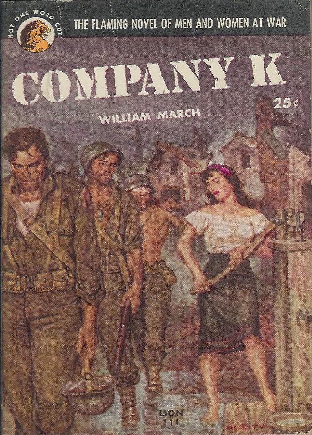
Paperback 215: Lion Books 111
(1st ptg, 1952)


Title: Company K
Author: William March
Cover artist: Rafael DeSoto


Best things about this cover:

  • DeSoto is one of the great naturalistic cover artists, and this cover is really expertly painted. Beautiful, detailed, evocative of the suffering of war. I'm finding this cover slightly hard to make fun of. Although ... if her stroking and pumping that giant lever isn't innuendo, I don't know what is. That is, if "she" is indeed a woman. The novel is, after all, "flaming."
  • I'm afraid of the guy at the front of that line. He looks like he's lost all hope ... or else he is a golem or a droid or something.
  • "The Flaming Novel of Men and Women at War" - sounds like a book about the battle of the sexes. "Men Are From Mars ... : WWI Edition!"

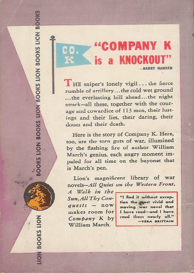
Best things about this back cover:

  • "Company K is a Knockout"! Letter play not so effective when the "K" is silent. "Company G is a Gnat-infested Gnightmare"
  • This back cover is in Love with alliteration. Courage and cowardice ... lustings (!?) and lies, daring, doom, and death.
  • It's appropriate that this book is somewhat purple, because check out the prose in that second paragraph. March impales angry moments with his bayonet-pen!?
  • I like the little flag, particularly the wacky font of the letters.

This is a pretty famous and well-received novel of W. W. I, organized into micro-chapters about every single man in the company. Blurbs inside from Granville Hicks, Graham Greene, James T. Farrell, and Phyllis Bentley (whoever that is).

Page 123~

On Monday a kid from my company named Ben Hunzinger got fifteen years hard labor for deserting in the face of the enemy, and a long talk from Mr. Fairbrother about justice tempered with mercy.


Whoa, "Mr. Fairbrother?" Is this an allegory?

~RP

4.03.2009

Phriday again!

Happy Phallic Phriday everone!

My first, second, and third reaction to this cover is WTF??? It's just wrong on so many levels. First, it's called "Touch Your Toes" and he's not even trying to do that. Second, it gives a date range, like he's someone we should know and care about, and as if this date range should have some significance to us. Third, I can't tell if that's a modesty dot or if he's straddling a doorknob. Seriously, I can't tell.

I did some research and I guess Baer is a photographer obsessed with having naked men reach for their toes. This is volume 1. There's a sequel. By the way, neither the cover nor the reverse shows a man touching his toes, even though that's what Baer was striving for. Oh, and to answer my own question above, it IS a modesty dot. If you use the "random page" feature of Amazon, just be aware that it's Not Safe For Work (well, depending on where you work, of course!).

Maybe I'm not artsy enough, but I find this kind of repulsive. Don't get me wrong, I love the male body, but this is just creepy. Thoughts?

4.01.2009

blurb smurb

Okay, so the cover isn't all that horrible, but I'm just ferklempt at the blurb.


If you can't read the fine print, it says

"It's unlikely you'll read a more unusual novel this year."


In what way can you possibly parse this to make it a good thing?!?

3.31.2009

Tuesday Toofer!


Hey y'all. So DocTurtle and I were out to dinner this eve and I said I was thinking of posting on my blog and he said, "you have a blog??" Seriously, I know I'm lame, but kudos and thanks to Rex Parker and Biker Puppy for keeping the home fires stoked. Y'all are my best friends that I've never met!


Anyway...some fun stuff that I've gotten in my e-mail lately (judgeabook (y'know) yahoo (ditto) com)


While it is true that all the cool kids hang in the library it is also true, as I've learned by moving from my previous incarnation as an academic librarian to my current life as a public librarian, that all the creepy kids hang in the library, too. And creepy old guys. Who smell like goats.


Thanks, Patrick!


And Jenna W sent this awesome link to IO9 with the creepiest crouching lady I've ever seen (not that I've seen that many crouching ladies, but I have been around). Hooker elves, too. Check it out!


Patrick tells me he'll be super gentle when sending me this cover from failblog:


It looks to me like little Timmy doesn't have to worry because Superman has, if that black stain is any indication, blown his superwad. Nothin' left but the cuddlin'.


And finally, a cover I found on my very own at my very own liberry!


In a perfect future world accordions cease to exist, they don't get spacier. But it's the expression on the guy's face (not to mention the blindfold!) that suggests to me this book would be better authored by someone from Ellora's Cave (a never-ending font of putrid covers!) or written by Pynk than the great (if sexually boring) Robert Heinlein. At least, I assume he was sexually boring. For all I know he was a furry.

3.30.2009

Popular outcast?

Before I start snarking on the title and cover, I have to admit I'm a huge Star Wars fan. (Yes, I'm a geek. I also do logic puzzles for fun. But on the flip-side, I also ride my Harley with my dog on the weekends. Does that redeem me? No? Hmm.) I love all of the six SW movies (I've seen A New Hope at least 100 times), and I've read a good number of the "expanded universe" books (books that go beyond the stories and characters of the movies). That's why I find this cover so very disappointing.
First, let's discuss the title. "Fate of the Jedi" is a good new series/trilogy/whatever title. I'm fine with that. But "Outcast"?? Focusing on the Hero of the Rebellion? The guy who single-handedly (well, maybe with a little help from his buddy Han) saved the universe from the evil grip of Darth Vader and the Emperor?? What?? Ok, I admit, Luke was getting pretty weird by the end of Return of the Jedi, and even weirder in some of the books that tell a "later" story, but an "outcast"? I think Mr. Allston was just being lazy in picking a title.

Low, let's get to the cover's aesthetic appeal. Or, rather, complete lack of any aesthetics. Why is it just orange and blue?? The SW universe is an amazingly vibrant and dynamic setting for any story, but all we get is dichromatic blah. There's what appears to be a unique-looking city-scape behind Luke, that might be very visually stunning if it were in color(s). Not to mention either a new Death Star or a cool-looking moon in the sky -- why don't we get to see it clearly? And what's with making Skywalker all blue? They could bother with an extra color for his lightsaber but not for his clothing? What's that boring white strip along the bottom? It appears to be either another city-scape or Luke's EKG reading, but you can barely tell it's there, because... well, it's all white. And why does Luke appear to be disappearing into it? Does the cover bore even him?

I suppose it's probably hard to find artists willing to draw Star Wars art or characters at all, let alone in full color. Seriously, if you search the Internet, you'll hardly find any at all. I guess the publishers did the best they could. Blah!

3.29.2009

Sultry Sunday #25: the weekly "Pop Sensation" crossover

Whoops, missed last week. Sorry about that. Moving right along ... carnies!
-----

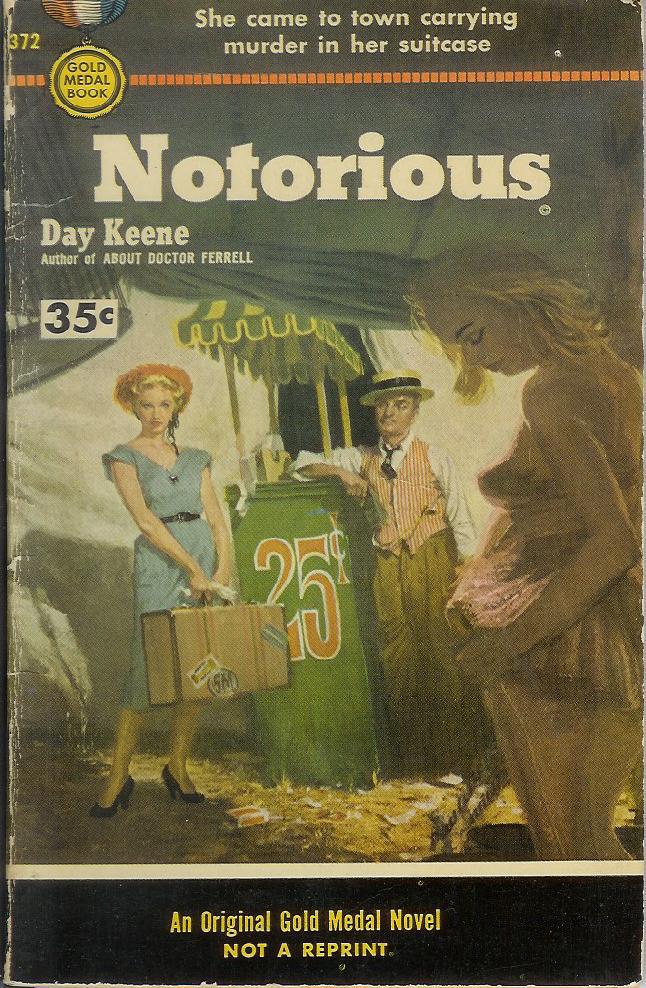
Paperback 212: Gold Medal 372 (PBO, 1954) - Canadian Edition

Title: Notorious (no, not that "Notorious")
Author: Day Keene
Cover artist: Uncredited


Best things about this cover:
  • The fact that the Canada-only "35c" price tag overrides the Giant "25c" sign in the middle of the cover painting.
  • Innocent country girl tries to make it in the big ... Carny?
  • "I want to look like her. Can you do that, leering carnival barker man?"
  • "So, whatcha got in the suitcase, lady?" "Murder." "Oh ... I see."
  • "Murder in her suitcase" - this makes me hope for something gloriously bloody, like a small chainsaw with which she starts beheading everyone in site: "Is this part of the show, mama?"
  • I Really wish the lady in the foreground weren't so damned shadowed

Best things about this back cover:

  • Say what you will about Day Keene, he could totally rock the 'stache.
  • Ferron! "They call me Ferron: The Iron Man"
  • "the main chance"? - is that Canadian for "the big score"?

Page 123~

Kelcey struck Ferron in the face. "Where's the money, carny? Where's the eighteen grand?"


~RP

3.24.2009

We sometimes think they don't have a brain, but ....

Full title: The Anti-Intellectual Presidency: The Decline of Presidential Rhetoric from George Washington to George W. Bush.
From the Publishers Weekly: "...Lim investigates what he sees as a particularly American phenomenon whereby most presidents have preferred to appear less, not more intellectually inclined than they actually were." Politics aside, it sounds like an interesting discussion, but the cover just creeps me out.

I mean, they say that clothes make the man, right? (Personally, I think if that were true, those of us who are still single and looking for Mr. Right could settle for Mr. Could-Be and just buy him the proper clothing. Trust me, doesn't work!) In this case, clothes are the man. Yikes. Ok, I get it, presidents don't want to appear like egg-heads that might make the average citizen feel dumb. Or something. But headless? And apparently neckless as well? That's just creepy. Apparently the White House has an amazing laundry facility. They can starch your shirt to the point where it can hold up a jacket, tie and collar, without you even in it. This could be why so many presidents seem so uncomfortable all the time. I suspect they use the same formula for the underwear as well.

3.20.2009

It's Phriday!

I went for the blatantly obvious today: semi-graphic picture and juvenile title. Teehee. I recall my male high school classmates constantly informing their female cohorts that it does, indeed, have a mind of its own, and therefore, what it does is not the boy's fault. Never. His. Fault. Apparently, David Friedman agrees.
The book examines the penis throughout history, and provides such tidbits (according to Amazon.com) as: "...the Romans, whose generals were known to promote soldiers based on penis size, saw it as an indicator of earthly strength." I know some women who agree, and promote their boyfriends accordingly.

Funny how they didn't think his face was very important -- we usually see this with women, don't we? And I love how the "O" of "Own" exactly circles the object of discussion. I usually try to get a picture of the book cover without Amazon's "click to look inside" marker on it, but I thought it was appropriate for this book. Teehee. I'm looking forward to hearing how many of you are put off by the cover and how many of you might pick this book up just because of the picture. I suspect it may vary based on gender and sexual orientation (and who is at the checkout desk where you would borrow or buy the book).

3.15.2009

Sultry Sunday #24 - The weekly "Pop Sensation" crossover

Fabulous find for you today - a small paperback publisher from the early 50s brings you naked dancing and more smoke than you're apt to see anywhere outside of a Pink Floyd concert.

-----

Paperback 207: Readers-Choice Library No. 8 (1st ptg, 1950)

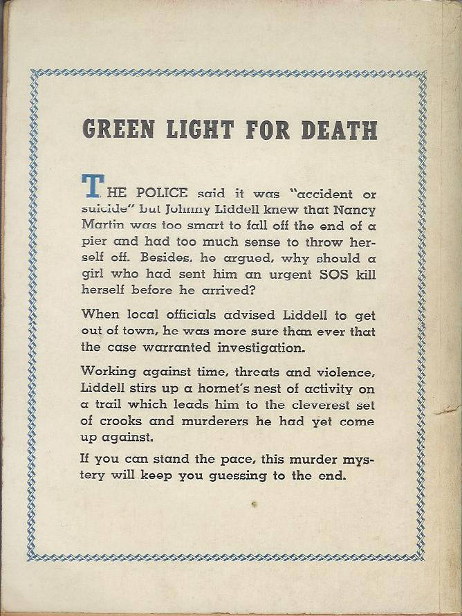
Title: Green Light for Death
Author: Frank Kane
Cover artist: [Blickenstaff]


Best things about this cover:

  • "Is that a naked banshee over there in the corner? Doing the Lambada? O man, I'm so wasted..."
  • "Misunderstanding the concept of "War on Drugs" completely, Johnny Liddell began firing randomly at the smoke that filled the room."
  • I have "marijuana!" written on the ID sticker on this book's plastic bag, but I can't find confirming evidence that pot is at all involved in this story. I will say, though, that there are references to cigarettes, pipes, and smoking in general on virtually every page.
  • Love love love the naked dancer's necklace, captured in mid-air. Lovely.
  • Also love the disaffected Brando look-alike at the small of her back. For some reason, in my mind, he is French.

Best things about this back cover:

  • Text!
  • I'm not sure "accident or suicide" really warrants quoting.

Page 123~

Liddell's eyes sought out Mike Lane where he sat gloating like an obscene Buddha, his tiny eyes fixed hungrily on the cavorting girl, his head nodding in time to the music.

Unless Mike Lane is a fat Asian hip-hop fan, this simile sucks.

~RP

3.08.2009

Sultry Sunday #23 - The weekly "Pop Sensation" crossover

OK, Rex Parker here, back from being sick / at the American Crossword Puzzle Tournament. Yes, my life is exciting, thanks for noticing. Today, I actually feature books that contain good writing. For once.

-----

Paperback 204: Ace G-512
(1st ptg / 1st ptg)

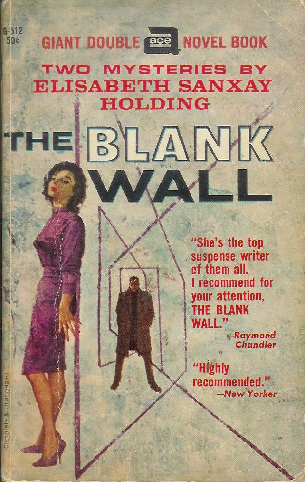
Title: The Girl Who Had to Die / The Blank Wall
Author: Elisabeth Sanxay Holding
Cover artist: Uncredited / Uncredited

Yours for: $11


Best things about this cover:

  • There was this floating head that liked to eat sailboats, which made the tall, dark, mysterious man on the beach very sad. The end.
  • What is it with the rainy day covers on all these Holding novels? Dreary and decidedly unhot. More skin, please.
  • Actually, on third or fourth look, the streaks look less like rain than like the trim on some elaborate fur hat. Or a really, really bad haircut.

Best things about this other cover:

  • This is one of my favorite pieces of crime fiction ever written. Ever. Seriously, it's that good. And unusual. Super suspenseful, with really complex and interesting characters. Women that aren't just femmes fatales. Just great. Provides a fascinating glimpse into domestic life during WWII (i.e. while the husband is away at war). Wish it would stay in @#$@ing print!
  • More lazy art. Etch-a-sketch posing as op-art. And I think the guy from the other cover just walked through the book and ended up here. That lady is not a very good hider.

Page 123~ (from The Blank Wall)

"Here's something you might be glad of," he said, and held out three little capsules, bright yellow.

~RP

3.02.2009

Yoooo hooo!

Instead of "The Amateur Marriage" this book should be entitled "The Amateur Homeowners." Or "The Amateur Exhibitionists." I had a neighbor like this once. Very disturbing. I'm pretty sure he had no shades or drapes on the window at all, because they were always open. Maybe he truly was an exhibitionist, but he frequently paraded around naked with a light on at night. Perhaps "paraded" is the wrong word, but he definitely walked around. Unfortunately, it wasn't Brad Pitt or Russell Crowe, you know, a guy you might enjoy seeing walk around in his bedroom. No, he looked a lot like Michael Moore. Very, very scary. I think he accounts for some of my neuroses.